
This topic will explore various ways to plot the Pace of Trade (sometimes referred to as Pace of Tape).
The chart below plots both the pace of trades as well as the pace relative to the average pace during same time period of past 5 days, allowing users to clearly see how the pace compares to the pace of the same time period during prior sessions.
In the middle pane, the raw pace (number of trades per unit time) are plotted. This chart is set to 5-min bars so we are simply plot the number of trades per 5-minutes. The periodicity may be changed to 1-min and the results will then be the number of trades per minute. This is accomplished by simply using a Moving Average set to 1-period average of Trades/Ticks (resulting in simply the raw number of trades per bar). This would be considered the raw pace.
The bottom pane plots the relative strength of that pace compared to that of the same time period (bar) during the past 5 sessions. A value above 100 (in green) signifies that the pace is greater than the average, while a value below 100 (red) signifies a pace below the average. A value of 50 would signal that the pace is half that of average, while a value of 200 would signify that the pace is twice the average of same time period of last 5 sessions.
Chart Definition: https://www.linnsoft.com/charts/pot-relative-pace-nq
(Important chart note - In order for lower pane to plot properly, you must be retaining at least 6 days of tick data on the charted symbol so the indicator can properly compute the average pace of previous 5 days).

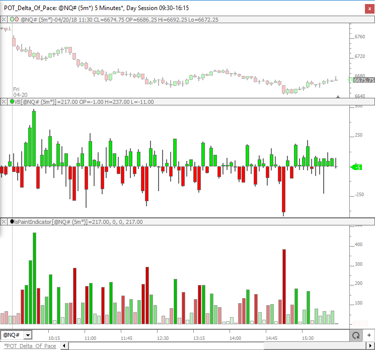
In the chart below, we break up the trades based on whether the trade hit the ask/offer or the bid and then take the difference between the two to give us the Delta of Pace. The middle pane uses the Volume Breakdown indicator to plot the Delta of Pace as candles (showing not only the delta of pace of bar, but also the highest and lowest achieved during formation of bar). The bottom pane plots the absolute value (magnitude) of that delta but pained with a gradient of darker green when delta is positive and darkening red when delta is negative. The bottom pane uses the Paint Indicator to accomplish this effect and plots the delta of pace as an always positive value but uses the coloring to differentiate between postiive (more trades at ask) vs negative (more trades at bid) values.
Chart Definition: https://www.linnsoft.com/charts/pot-delta-pace-nq
If you have any questions about the charts above, or other ideas relative to Pace of Trade / Tape that you'd like to see charted, please respond to this topic.
Looking under the covers at the indicator settings used for the charts above.
The raw Pace of Trade is accomplished simply with a Moving Average (see below). Notice a 1-period smoothing is used, which results in the raw number of trades or ticks per bar. Users may provide a value greater than 1 to get a moving average of this pace over time.
The relative strength of pace is accomplished using the always versatile Session Statistics indicator. This combination results in a taking the current pace, dividing it by the average pace of past 5 days, and multiplying the result by 100. The result is a value that oscillates about 100 with values over 100 signifying a faster pace than average (5 day) and below 100 signifiying a slower pace than average.
The Delta of Pace is achieved using the Volume Breakdown settings below. Notice on the top right that "Trades" is selected instead of "Volume" which changes the results from a delta of volume, to a delta of trades (pace). By plotting the results as "Delta Bars" we can clearly see the maximum (high) and minimum (low) delta achieved during the formation of the bar, giving the user a clearer picture of the path taken during that time period.
This chart compares the pace of the big trades to the pace of the small trades. The 2nd pane shows the pace of larger trades (green) and the 3rd pane shows the pace of the smaller trades (red) and the bottom panes shows the difference between the two (adjusted using a multiplier for the larger trades).
The two buttons at the top are important. The Size = (C#1) button controls the cut-off level for size. In the chart below that value is set to 5, so the large trades are those with size > 5 and the smaller trades are those with size <= 5. The second button is the multiplier used to compute the value in the lower pane. When comparing the pace of the big trades to the pace of small trades, it multiplies the pace of large trades by this value (20) and then subtracts the raw pace of small trades. In my observation, there were about 20 times more (on average) large trades than small trades. This will obviously need to be adjusted as the size is adjusted (or the symbol is changed). Experiment with values until you observe an equal number of green and red bars in the lower pane (as seen below). The Consolidated Tape feature (for IQFEED users) will certainly impact the results (see: https://www.linnsoft.com/videos/consolidated-tape for more on Consolidated Tape).
Chart Definition: https://www.linnsoft.com/charts/pot-pace-size-delta-nq
Very interesting Chad. I'm using the Consolidated Tape feature with IQFeed, so a multiplier of 20 doesn't seem appropriate. I've changed the instrument to ES, the periodicity to 1 minute, and the size filter to 100 -- for those settings with the CT feature it appears a multiplier of 150 is more appropriate. Any thoughts on these settings? Also, the linked chart definition doesn't currently have a button to set the multiplier (the CI is hard-set at a multiplier of 20), so I changed the CI to refer to C#2 and added a button to set that number. Thanks for these cool ideas!
OK. I replaced the chart/definition to include the button for multiplier (C#2). Thanks for pointing that out.
In some limited testing with ES (Consolidated Tape), if you leave size filter at 5, a multiplier of 3.5 seems appropriate. Changing the filter to 100, then it seems like a multiplier on the order of 120 would be appropriate. 150 will probably work fine. What I tend to do to figure this out is add an average to both the big and small paces like you see below, and then compute the ratio of the two (current values).
I was curious about the logic of how the POD bars are painted vs price bars vs total trades bars. Sometimes, the red price bars come with green total trades bars and vice versa, and the color of the Pace of Delta does not always follow the price bar either.
The price bars are simply colored green when price closes above open and red when price closes below open.
In the Delta of Pace candles (VB), the candle body is green when the delta is positive and red when delta is negative.
The two colors are often in synch, and certainly related in general....you would expect if there are more buying trades (ask) than selling trades (bid) within a bar, then generally the would go up. But that's not always the case. Keep in mind we are ignoring Volume completely in this study (easy enough to insert back in) and just counting the number of trades. So it is possible that although there are 100 more trades on the ask than those on the bid, the volume of the trades on the bid could still be much greater (and therefore the bars is more likely to close down). Hope that explains.
I was more interested in why a Delta of Pace candle would be green, while the same Total Trades/Ticks candle could be red. If both are broken down in trades and not in volume, I would expect them to be directionally the same? If a total raw trades/ticks candle is green, doesn't that mean that more trades went on the offer vs the bid?
Not sure specifically what "total trades candle" you are referring to. The total number of trades per bar is always going to be a positive value (and plotting total trades per bar would just be a histogram display, not really a bar or candle with a high/low/open/etc). The delta of trades (number of big trades minus number of ask trades) however can be both positive and negative. Again, if you share a screenshot pointing out specifically what you're referring to, that will help. FYI if you copy an image to clipboard (using programs like Jing, SnagIt, etc....you can just paste right into a post. It's also useful to use this button to expand the text entry box...
And then click it again when done in order to submit post.
for whatever reason, it will not allow me to attach a screenshot
What browser are you using? Are you trying at attach an image? or paste in a screenshot?
Pages