
This following chart makes it easy to analyze movements from one pivot point level to another: https://www.linnsoft.com/charts/hw-pivotmoves-v-es
(Note : Above chart definition has been uploaded in May 2025 - It includes the same exact calculation than detailed in the original post from February 2017, but with a format compatible with the latest pivot indicator as available in Investor/RT 15)
The chart essentially answers the question: If price moves to any given pivot point point level during a session, how often does the return to another pivot point level. For example, if price reaches R2, how often does it return to PP. If price falls to S3, how often does it return to S1. The three buttons at the top control the 2 pivot levels, and the direction of movement from one pivot to another.
Look at the chart below for a specific example. The prices can be set from -3 to 3 representing anywhere from S3 to R3. -3 = S3, -2 = S2, -1 = S1, 0 = PP, 1 = R1, 2 = R2, 3 = R3. Direction can be set to either 1 (moving upward from one level to another) or -1 (moving down from 1 level to another). The chart below has Price 1 set to -3 (S3) and Price 2 set to -3 (S2) and Direction set to 1. Therefore, it is looking to see how often price move down to S3, and of those days, how often it returned upward to S2 after hitting S3. Out of 1459 days, 184 days price dropped down to S3 (12.6% of the days), and of those 184 days, 42 days price returned up to S1 after reaching S3 (22.8% of the 184 days).
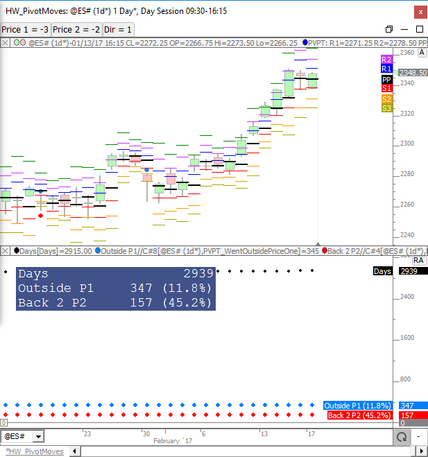
Every move between pivot levels is summarized in the table below. This table reflects the day session pivot levels on ES over a 2939 day period ending 2/17/2017. The chart presented in the previous post was used to feed this table. The Origin column tells where price opened relative to each pivot level. The Direction column controls the direciton of the movement. The top two columns present the results in days, while the bottom two tables present percentages. Two random columns were highlighted in yellow and pink as examples. The yellow example tells us that of the 696 days price went below S2 (which is 23.7% of the 2939 days analyzed). And 305 days we subsequently rose back above S1 which was 43.8% of the 696 days we went below S2. In the pink highlighted example, we find that 2460 days price went above PP which is 83.7% of the 2939 days analyzed. And 118 days we subsequently fell back below S3 which was 4.8% of the 2460 days price went above PP.
The table below shows the count and percentages of the moves from the opening pivot zone to each pivot level. There are 8 pivot zones (below S3, S3 to S2, S2 to S1, S1 to PP, PP to R1, R1 to R2, R2 to R3, above R3). The table counts the number of times we open in each of the 8 pivot zones, and shows how often, after opening in each zone, price reaches to or beyond each pivot level. The table was produced using 2939 days of day session data on ES ending 2/17/2017. As an example, price opened in the PP-R1 zone (between PP and R1) 1192 times or 40.6% of the time, more than any other zone. When we opened in the PP-R1 zone, 766 times (64.3% of the 1192 days we opened in PP-R1 zone), we moved to or beyond the PP. 313 times (26.3%) price dropped to or beyond S1. 120 times (10.1%) price dropped to or beyond S2, etc. One number that jumps out is the 55.9% number when opening in < S3 zone (below S3) price moves back above S2 55.9% of the time (19 of 34).
The chart used to produce the table above can be seen below and the chart definition can be found here: https://www.linnsoft.com/charts/hw-pivotzonemovesfromopen-v-es
(Note : Above chart definition has been uploaded in May 2025 - It includes the same exact calculation than detailed in the original post from February 2017, but with a format compatible with the latest pivot indicator as available in Investor/RT 15)
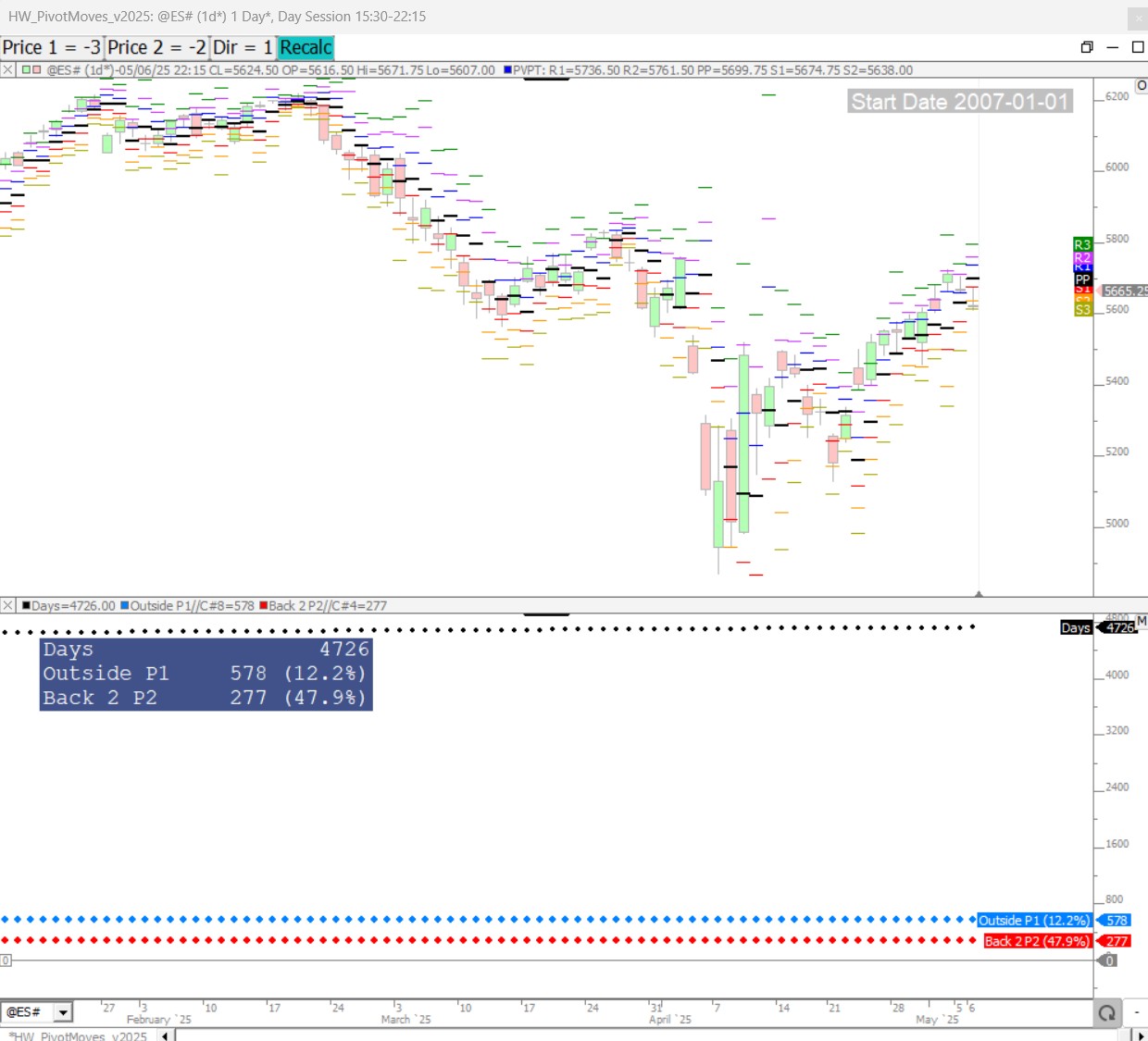
Here is a screenshot of the latest statistics (for the same Price 1 / Price 2 / direction configuration) with the chart as run in May 2025 (4726 days)
The Value Area Zone analysis is similar to the pivot zone analysis above, but this time we use the VA Zones of < VAL, VAL to POC, POC to VAH, and > VAH. The table below shows how often price opened within each respective zone. And when opening in a given zone, the table shows how often price moved to or beyond each of the 3 levels (VAL, POC, VAH) along with percentages. 2950 days were analyzed using day session data on ES ending 2/17/2017. As an example, of the 2950 days analyzed, 1015 days we opened between VAL and POC (in the VAL-POC zone - more than any other zone). This reflected 34.4% of the days. On those 1015 days we opened in VAL-POC zone, 744 days (73.3%) we moved below the VAL, 927 days (91.3%) we moved above the POC, and 717 days (70.6%) we moved above the VAH.
The most difficult recovery on the board was opening below the VAL but moving back above VAH at only 34.9% of the time. However, looking at it from a different angle, if price opens below VAL and moves to POC (289 times - 55.8% of time), then of those 289 days, 181 times it proceeds to VAH. So on those < VAL days, once price reaches POC, we know we have a 181 / 289 (or 63%) chance of proceeding to the VAH before days end. Similarly, when opening above VAH and moving to POC (388 of 699 times or 55.5%), 68% of the time we continue to VAL by end of day.
This chart was used to produce the statistics in the table above: https://www.linnsoft.com/charts/hw-vazonemoves-es
The Lower Price controls the lower boundary of the zone and upper price controls the upper boundary of the zone. Specify -2 and -1 respectively for Lower Price and Upper Price for < VAL zone. Specify -1 and 0 for VAL-POC zone. Specify 0 and 1 for POC-VAH zone. Specify 1 and 2 for > VAH zone.