Hey IRT traders,
I've been asking Chad a lot of questions lately, so thought I might try to give something back to this community that is, hopefully, a little out of the ordinary, and maybe helps improve your trading results.
Over the last six months, it got harder and harder for me to read all these flickering numbers on the screen. At the end of a trading day, my eyes would hurt. I strained to read the numbers on the charts.
I got some glasses and this inspired me to think about eye-strain in general. I had an epiphany and discovered that it's more difficult to FOCUS when my eyes are strained.
Now, I'm a discretionary day trader and use Chad's kick-ass tools to trade global futures markets. And if you trade futures, you know that they can move really fast, and this requires intense focus.
The Good Doctor Brett Steenbarger might suggest to you that a LACK OF FOCUS and CONCENTRATION is one of the biggest problems that most traders encounter on the path to achieving consistent profitability. A lack of focus and a lack of an edge.
Forget about all that trading psychology B.S. It's a distraction.
Let me just suggest: One reason you might not be achieving the trading results you desire could be due to the difficulty in ABSOLUTELY focusing your attention not only to the market, but on the right kind of information in the market, and ignoring the noise.
But, FOCUSING on just one thing, like the HSI futures, or the NQ, for hours on end, is EXTREMELY difficult, in today's world of distraction.
So, a little thing like eye-strain, I think, hurt my trading results. It caused me to knee-jerk react sometimes. Or, miss good set-ups.
I had to fix this.
------
Wayyy back in my career, I worked for thinkorswim, and later, TD Ameritrade. I remember my first time in Chicago at the TOS offices and immediately noticed EVERYBODY's chart had a black background. We were on a tour with Sosnoff. I can't remember who explained it, but it made sense:
Black background is easier to look at all day, easier on the eyes. (I vaguely recall some science behind this. Look into it for yourself.)
Up until that point, I had always used charts with a white background. But I switched to black after my first trip to TOS HQ. I noticed a huge difference right away.
-----
In thinking through my eye-strain problem, for some reason, I remembered my experience working with a HF trader out of Vegas, who I'll call Captain Blackjack. Crazy character, wicked smart programmer, wayyy ahead of his time developing algos.
The Captain liked to call his charts his "HUD." This acronym stands for Heads Up Display. Google that term and you'll see a HUD on the windshield of a car.
Well, back in the day, The Captain fancied himself a fighter pilot and would always talk about his HUD charts as if he were staring out the window of his cockpit.
-----
Remembering the Captain inspired me to ask: Okay, besides trading, there have got to be other jobs that require absolute focus for prolonged periods of time while staring at a bunch of numbers. What are these jobs and how do these people reduce eye strain?
And the obvious answer was a pilot.
Think about a flight to Asia or Europe. These folks are staring at numbers, often in the dark (I’m using a black background), for long stretches of time.
Now, search the term "pilot heads up display."
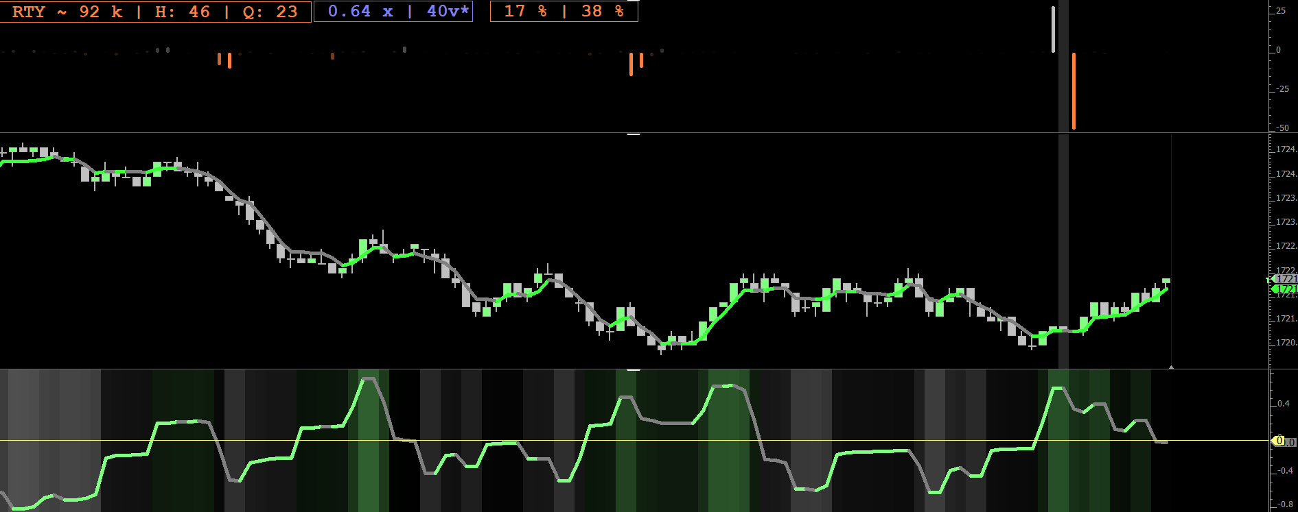
As I went through this exercise, I continued to encounter 2 colors: green and orange. In particular, that "Matrix green" and a creaminess orange. This is to say, both colors are really light and bright, providing a nice, high contrast, against the black background.
Some of the newer HUDs are using a cool, light blue. Almost neon. Some purples. And a light yellow looks awesome against black.
I concluded that if commercial and military aviation instrument makers use these colors, then there was probably a good reason for it, and a ton of gov't funding research that went into it. :-)
-----
Up until these last few months, I had used Blue = Up and Red = Down on my all charts FOREVER. I always hated the green/red color, so I used blue/red.
Now, this is where I'm going to feel a little hippie-dippie, but hear me out.
I don't think red is a good color for a trader to have on their screen. Ever. Read a little bit about color theory and the different feelings that different colors inspire. Conclude for yourself.
Here’s my take. Red is alarming. Like an alarm. Like all the red alarms around us in life. Like a firetruck. Red can be scary. Like, a big flush lower and all those red candles painting on my chart, and I would think, "Oohhh, that's bad." This is the wrong reaction because I'm trading futures and, for the most part, should be indifferent to direction.
Blue, on the other hand, is calming. Cooling. Soothing.
I don't want to feel too calm, and sure don't want to feel scared, when I'm risking money. I don't want any feelings. But if there's anything I want to feel, I want to feel prosperous, which brings me back to the green that pilots use in their HUDs.
Green is the prominent color in my charts.
But what about down? I struggled with this for a while, until my wife, who has a great sense of style, and a good eye for color, suggested gray.
And I started thinking...gray. Gr-gr-gra-gra.......gravity! Pulling prices down.
Hippie dippie, right?
-----
The payoff:
I suggest, if you stare at a chart, for 8 or 10 hours a day, like I do, put some thought into it.
I love a BLACK background. Like the TOS platform to this day. The black background is easier on the eye, and could reduce some strain, and make it easier to focus and concentrate on the markets.
IF you choose to use a black background, and whether you want to believe the hippie-dippie stuff, or trust in the application of certain colors across commercial and military aircraft instrumentation, I suggest looking for yourself at which colors pilot's use to display information against a black background.
Study some color theory. Play with a color wheel. Find a pleasing combination to your eye.
I suggest never using red and always making green a prominent color.
I will tell, with a doubt, it's much easier for me to look at this chart. My results have improved since I made the switch, and I can trade for longer stretches of time.
And with Chad's fancy Paint Indicator, especially with the gradient applied, well...my charts have, become, almost pretty to me. Pleasing to my eye.
I'll conclude with this thought: The longer I trade, the more I realize, it's all about the small details.