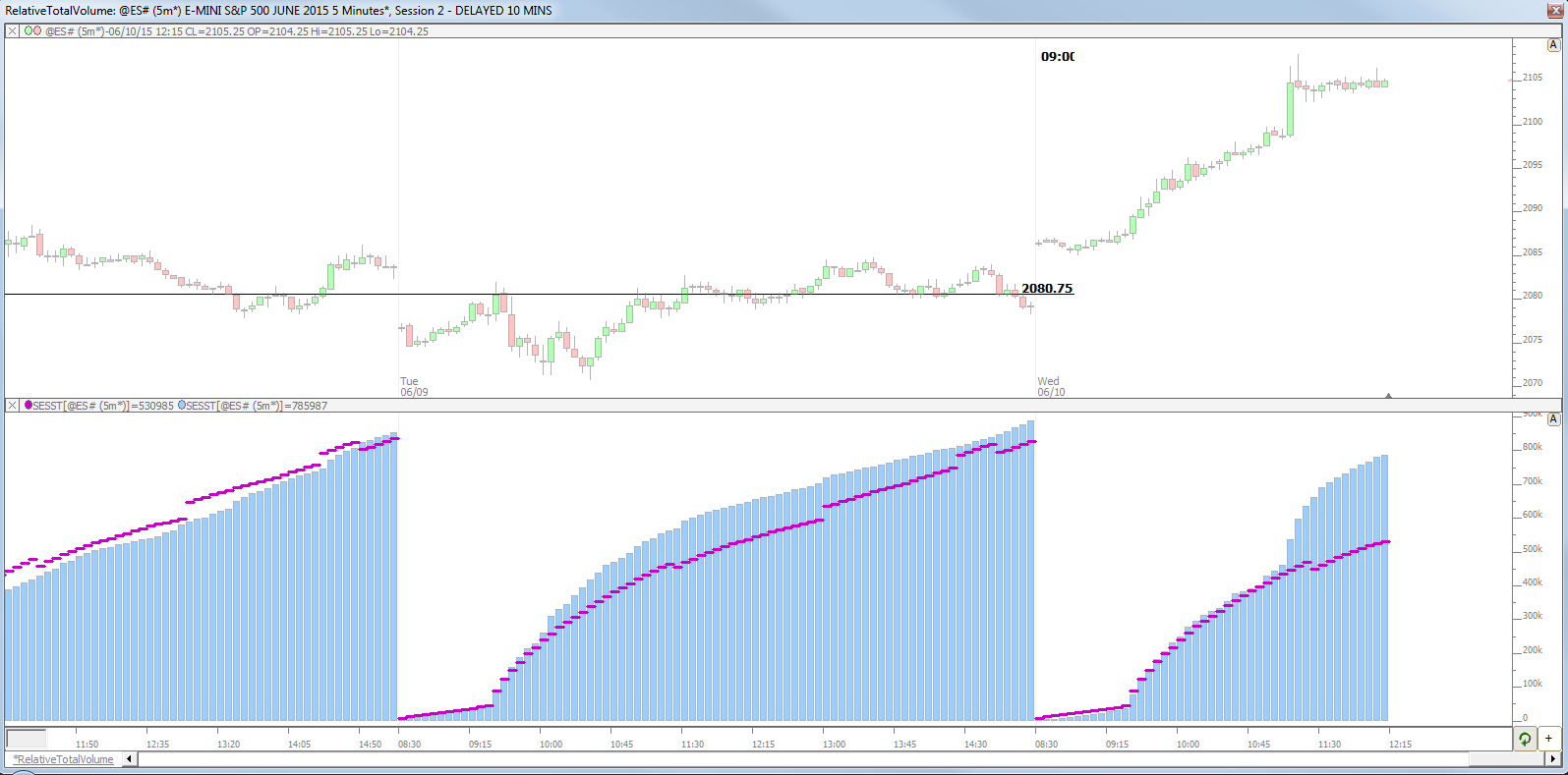
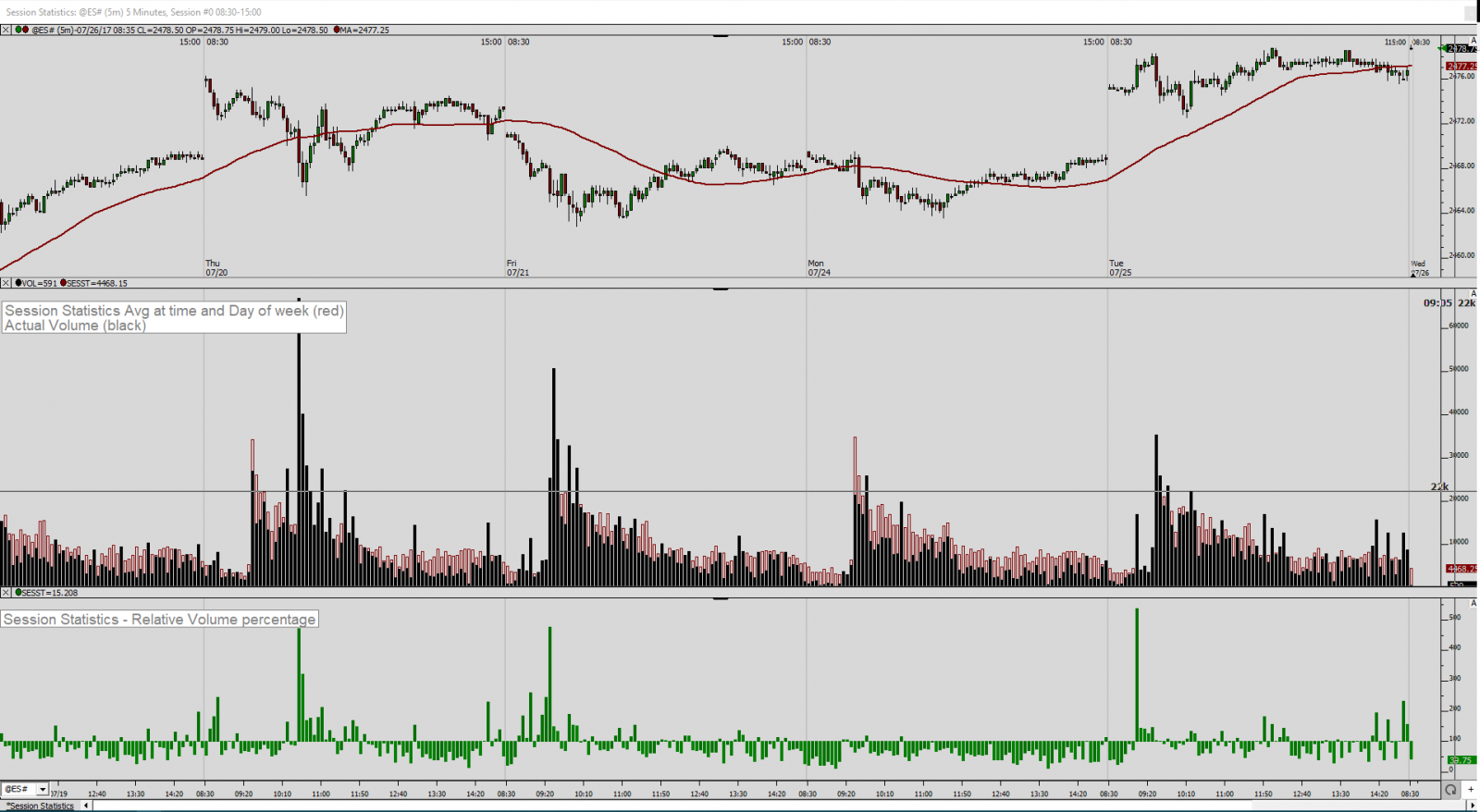
This post explains how to paint the candles that have high volume compared to same time period of previous days. More specifically, this chart is going to highlight the bars that have a greater volume (for that 5-min period) than the average volume of that time period over prevoius 10 days.
Chart Definition: https://www.linnsoft.com/charts/cp-bigvolattime-es