Background :
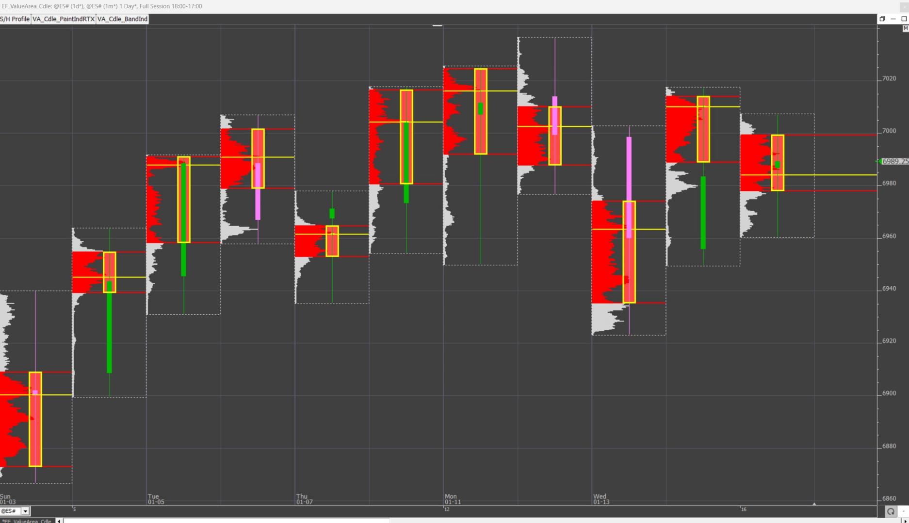
This tips page is focused on how to display a Value Area “Candle” (or bands) on a traditional candle charts
Attached chart involves the following features :
- Using the Paint Indicator to display custom candle reflecting the Profile Value Area on a daily chart periodicity (set to match the current day session)
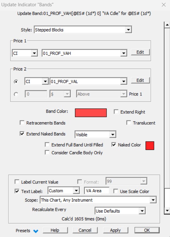
- Using alternatively the "Band" Indicator to achieve the same effect, with the option to extend "naked" Value Area Profile bands.
https://www.linnsoft.com/charts/ef-valuearea-candle-es
If you just want to add a Value Area Candle quickly on your own existing chart with a PaintIndicator, just follow the instructions detailed on Step 3 (Steps 1 and 2 are just there to explain how to create the 2 underlying Custom indicators and how the correspponding settings of the PaintIndicator and Band indicators which can be both used for such a Value Area box display)
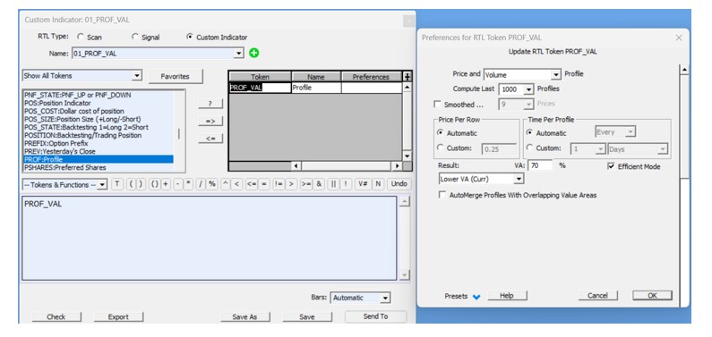
Step 1) Creating 2 Custom Indicators corresponding to the High and Low Value of your custom candle
When it comes to display a candle based on the Profile Value Area High and Low, (on a 1d* charty, ie a daily periodicity built from intraday data), you first need to create 2 custom indicators using the Profile token, ie one CI returning the Value Area High, and the other the Value Area Low
Generally speaking, for these Profile tokens, make sure that you use the same settings (Price per Row / Time per profile) as for the Profile Indicator associated with these values
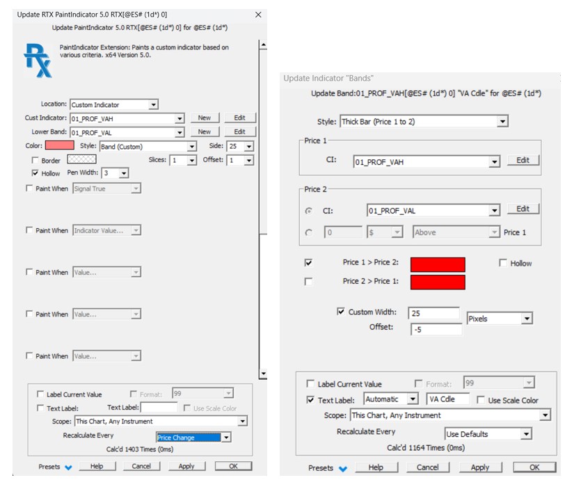
Step 2) Setting up the Paint Indicator RTX (or the Band Indicator) for simulating a candle
There are 2 possible indicators to create such a candle(PaintIndicator or Band indicator options). Both are included in the shared chart definitions
Option 1: Paint Indicator settings: use the “Band (Custom)” Style settings. You may adjust the total width (ie ”Side”) of the vertical band. If you need to display a hollow candle, you can also adjust the hollow line width (and this is therefore the best option for a hollow candle)
Option2: Band Indicator settings: use the “Thick Bar” Style settings. You may adjust the total candle width with the custom width option in pixels (and possibly adjust the position with an offset)(ie ”Side”). There is also a "hollow" checkbox (but without a line width selection) candle
Step 3) Importing the value area candle into your own charts (using Option 1 / PaintIndicator)
To import the PaintIndicator on your instance together with the underlying custom indicator (ie skips steps 1 and 2), the easiest way is just:
a) to import the shared chart definition on your instance (through the usual File > Open > definition process)
b) On the button pane of this imported chart, right click on the “VA Cdle PaintIndRTX” button, select "Copy Button", open the destination chart, point your mouse on the button pane area of that chart, right click again and select Paste (a CTRL+C / CTRL+V will also work)
c) Push on the newly copied button to add the "VA candle" on your chart - Edit the corresponding PaintIndicator settings to adjust the custom candle width “side” to your own chart pixel/bar settings
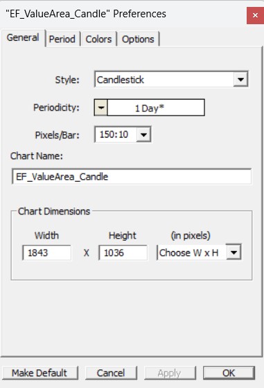
For the record, on the shared chart, my candle width settings were 150:10 (ie the candle is 10 pixel width, for a full daily horizontal scale of 150 pixel) while my “Value Area” candle is 25 pixels.
Reminder: When the pixel bar input is a single figure, the candle width will automatically fit the largest available space on the horizontal scale. When adding a second figure, this is forcing the candle width to that number of pixel. This way, you can display "thin" candlestick that won't prevent having a full display of the profile indicator (added "behind" in the chart element manager list).
Some further tips :
- Use the "Stepped Blocks" option of the Band indicator to get a fully colored Value Area background
- You may also, with that Band Indicator Style, activate the “extend” naked Value Area feature. More chart examples are available on this forum topic