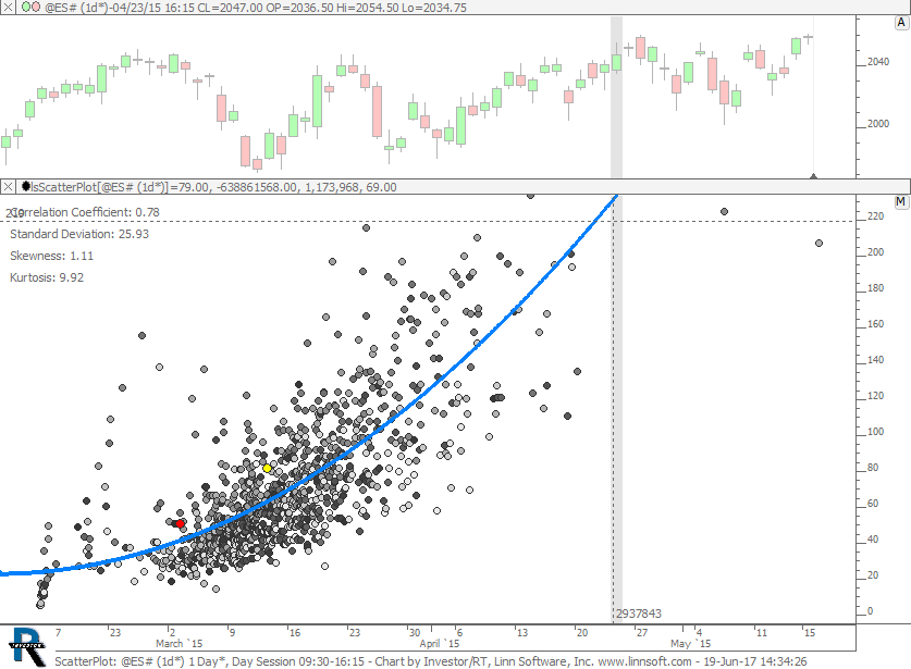
ScatterPlot takes two custom indicators and plots one on the horizontal (X Axis) and one on the vertical (Y Axis) and then computes a best fit polynomial regression line through the data of user-specified degree. Any two custom indicators may be used for the data set of this analysis. Each data point represents the values of the two custom indicators on any given bar. Each bar is drawn as a point/dot in the scatter plot.
For example, the indicator can plot the daily volume versus the daily range in price. With the resulting best fit line, a user may determine what volume should be expected for any given daily range (or visa versa).
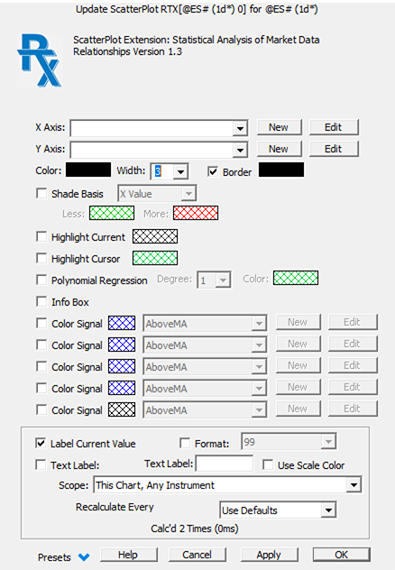
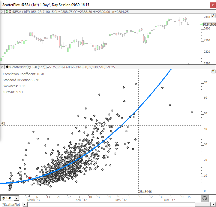
An optional Info Box provides several statistics of the data set: Correlation Coefficient; Standard Deviation; Skewness; and Kurtosis. Dot color may be shaded based on X Value, Y Value, or Time, or based on the result of Signal formulas. The value of the current bar can be highlighted in a unique color.
ScatterPlot introduces a new dimension of market data analysis in Investor/RT. See the Scatter Plot wiki for more information.
Presentation
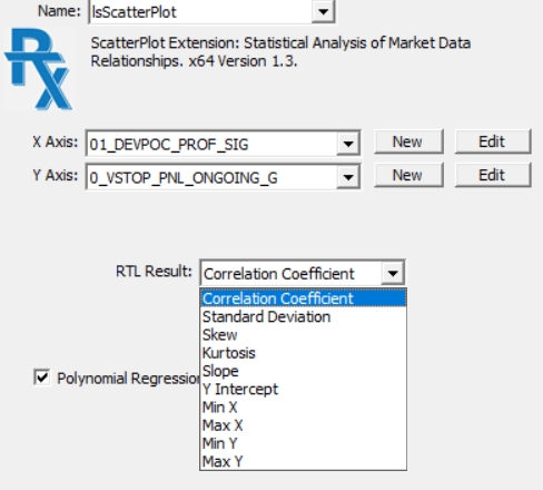
Please note that, as per Version 1.3, the result of the ScatterPlot can be included in Trading Signals and Custom Indicator formulas through the generic RTX token. Clicking inside a RTL Object editor windoiw on the RTX token (associated with ScatterPlot) opens the following RTL result selection box: